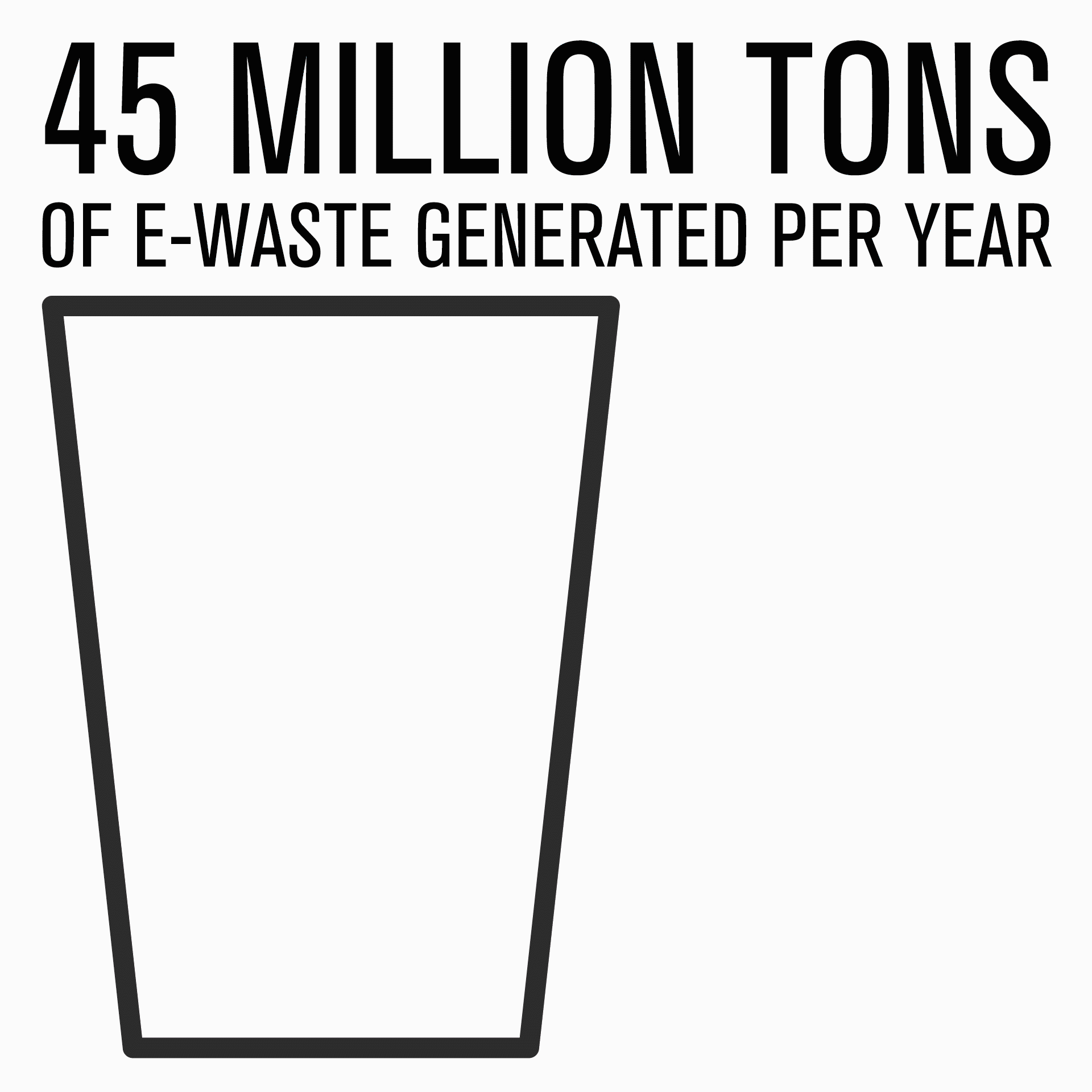
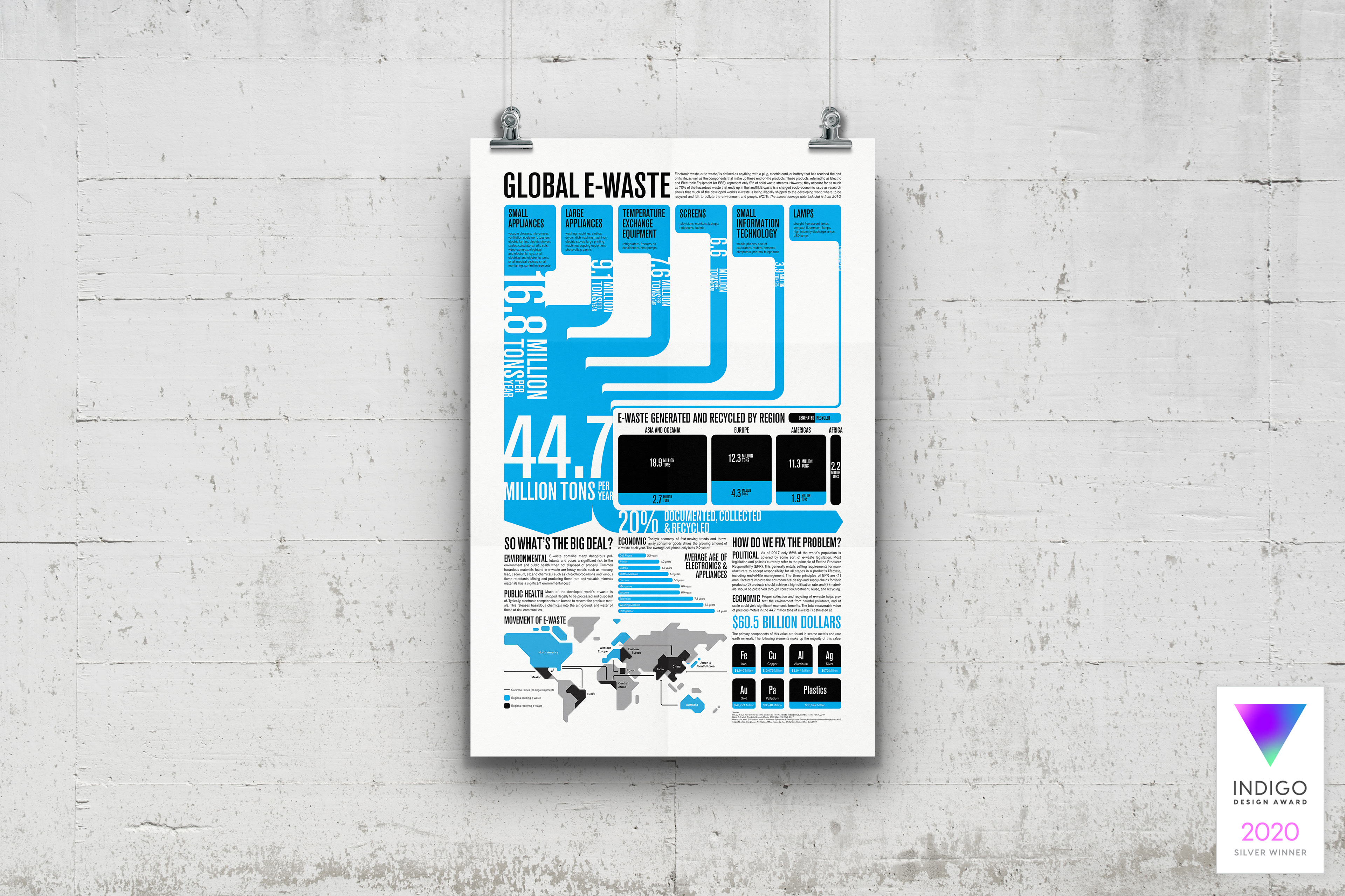
An infographic campaign to educate people about
the causes and dangers of electronic waste.
the causes and dangers of electronic waste.
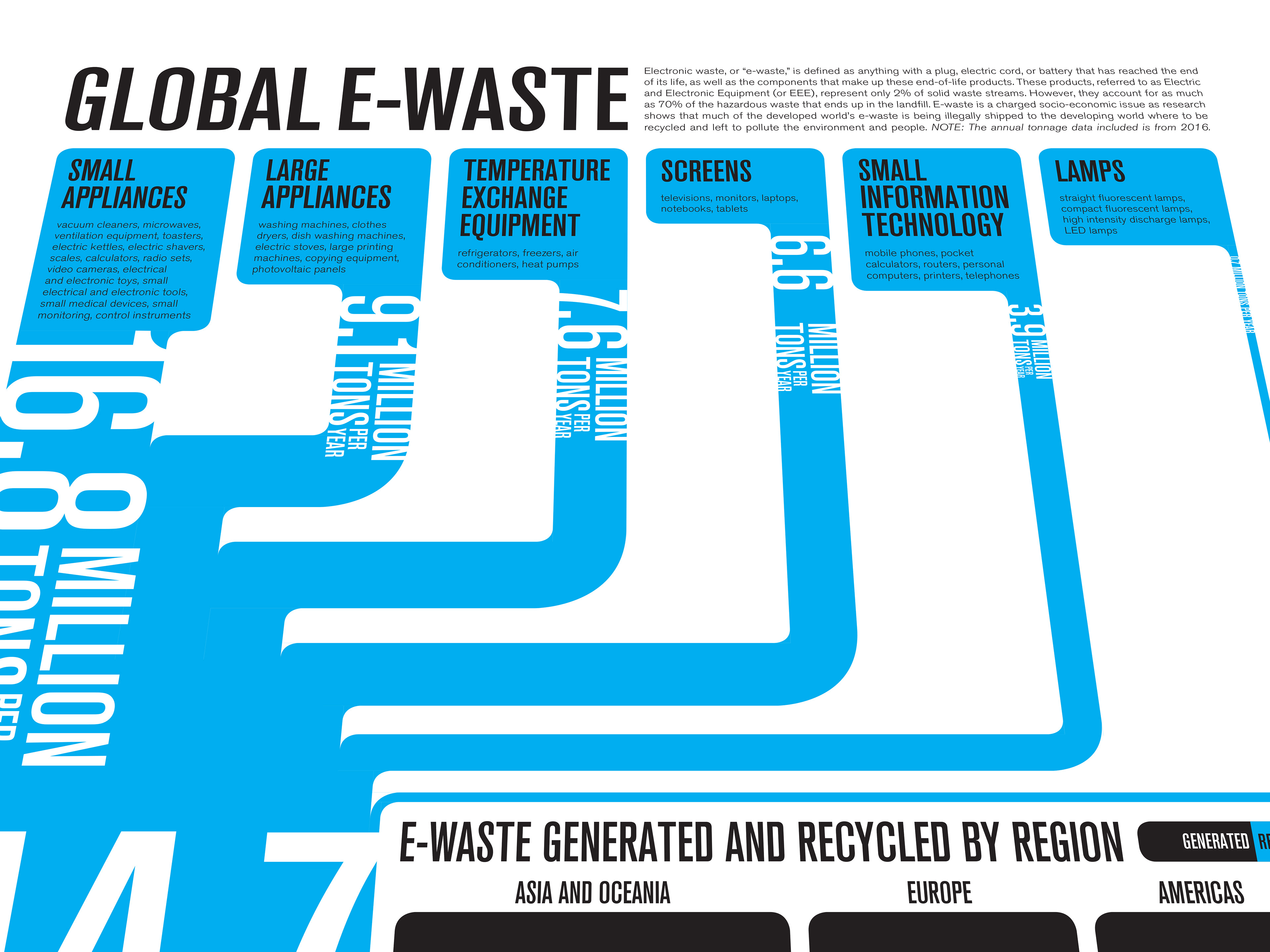
As an environmental studies major in my undergrad I became deeply interested in the issue of electronic waste. Rather than writing a final paper for one of my classes, I created my very first animation (watch it if you dare) to summarize my research. Five years later and with actual animation and typography skills in my toolbox, I decided it was time to hone the concept to develop this infographic campaign educating people about the causes and dangers of electronic waste. The project started with the poster above and later developed into a series of animated gifs and website.
The design references the current trends in UI/UX design with rounded corners, 12 column layout, and what perhaps feels like the physical equivalent of a responsive layout. The accent blue symbolizes trust, intelligence, and truth. I chose a particularly electric blue to zap the viewers' attention while staying cool enough that their eyes can sit with it for a while. This color lies somewhere between the cyan inks used in color printing and the glow that shines from a screen in the dark.
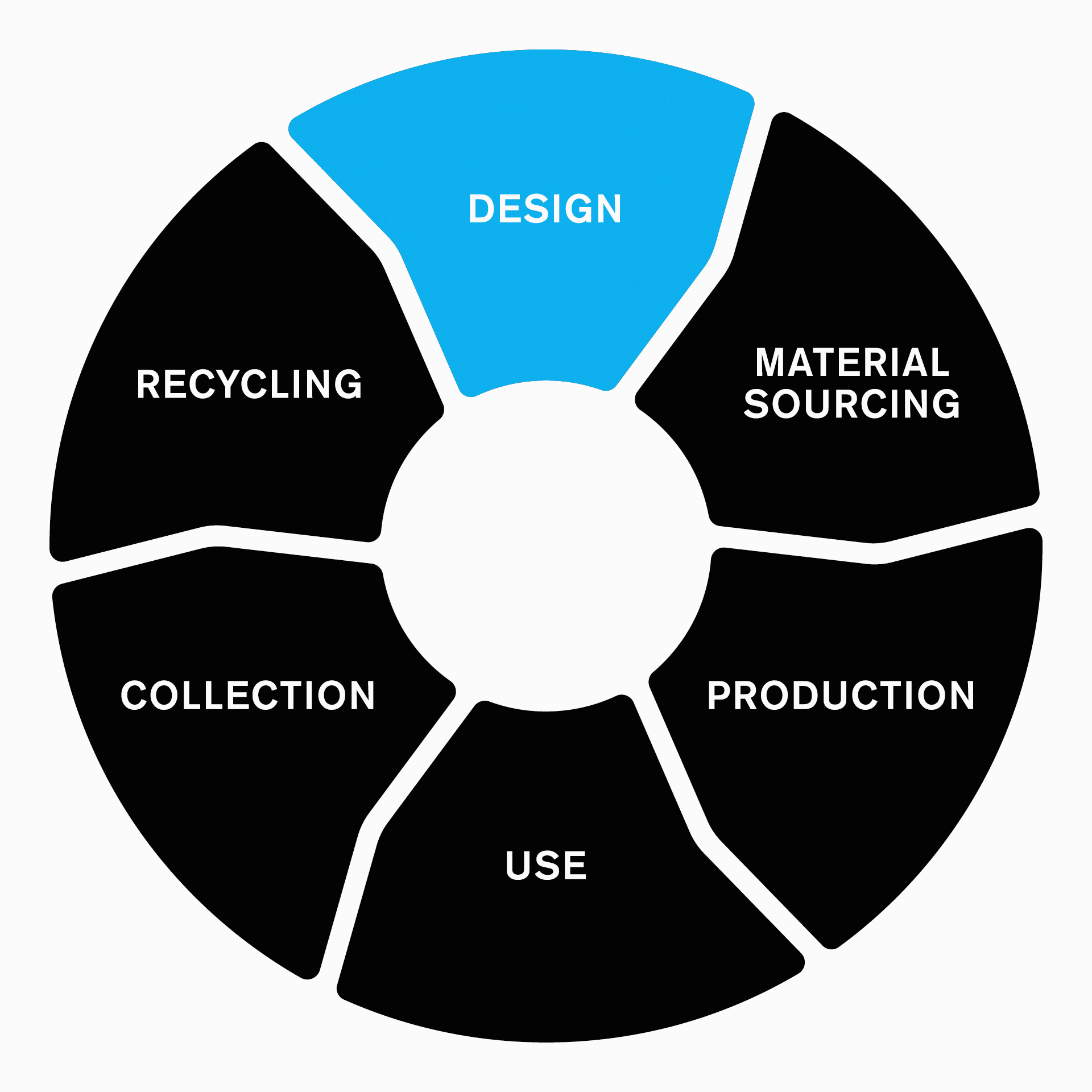
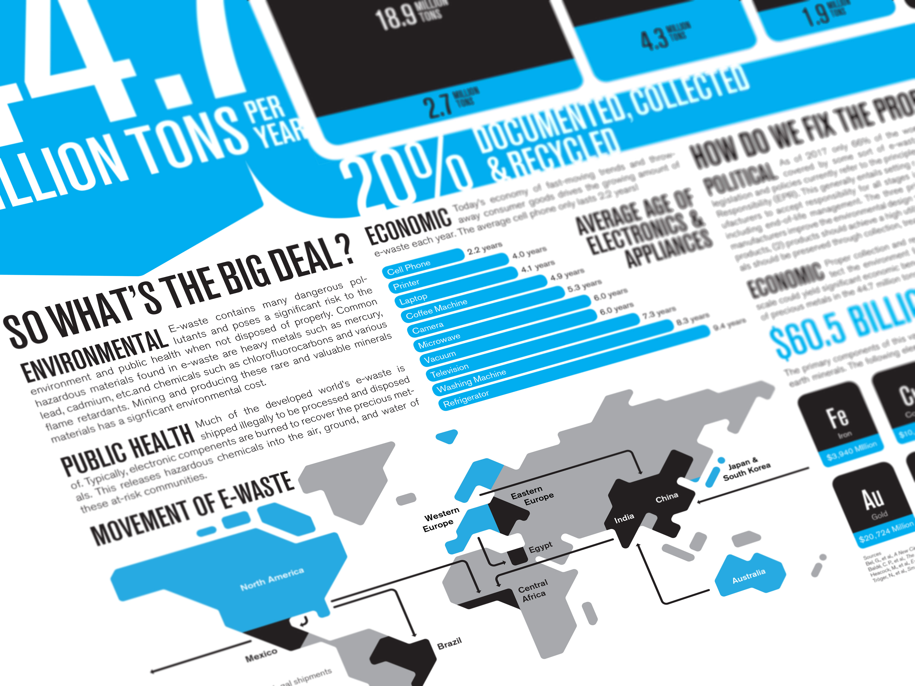
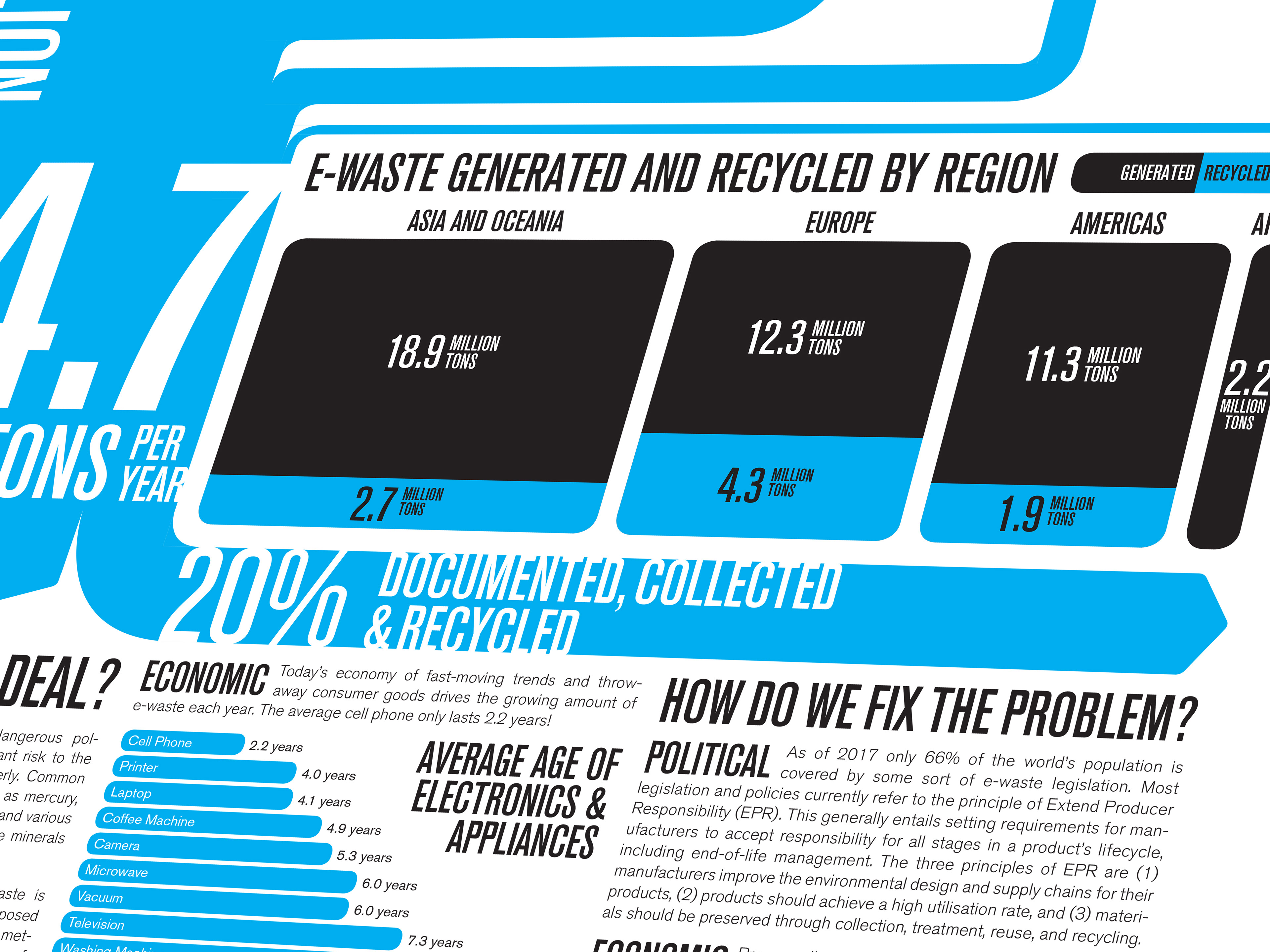
The overall layout of the infographic is designed to guide the viewer's eye along a logical path of unfolding information—first learning about the scale and nature of the problem and then eventually revealing how we might address the problem.
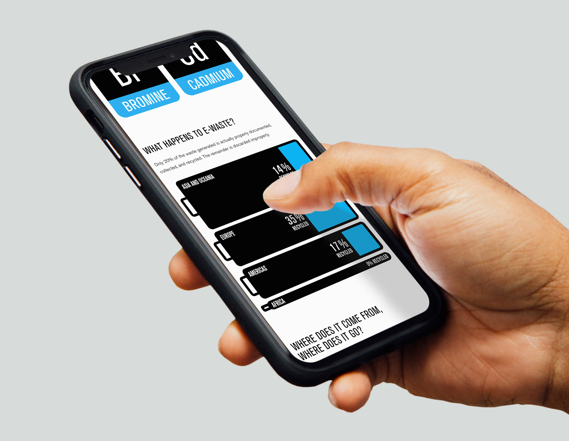
The next logical step was to make this information more accessible for a digital audience. To do this I built a website that developed the style of the poster into a series of animated gifs that tell the story of the infographic in a very linear and logical progression. This dices the information into bite-size chunks that are easy for an audience addicted to social media to digest. Each animation also stands on its own so it can tell its part of the story as a single social media post.